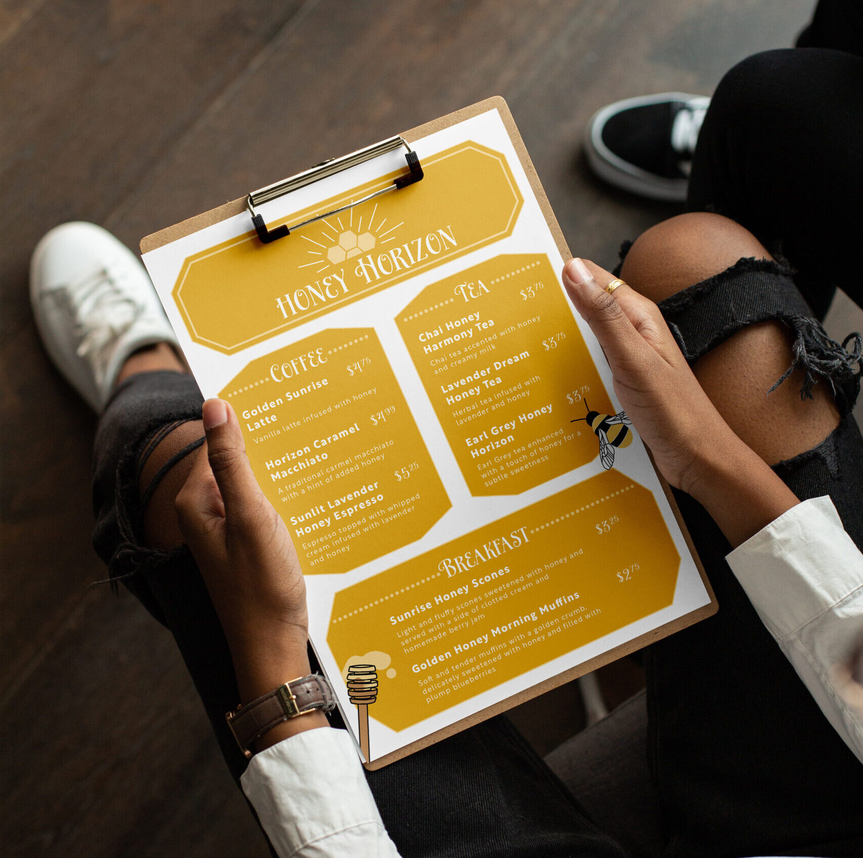
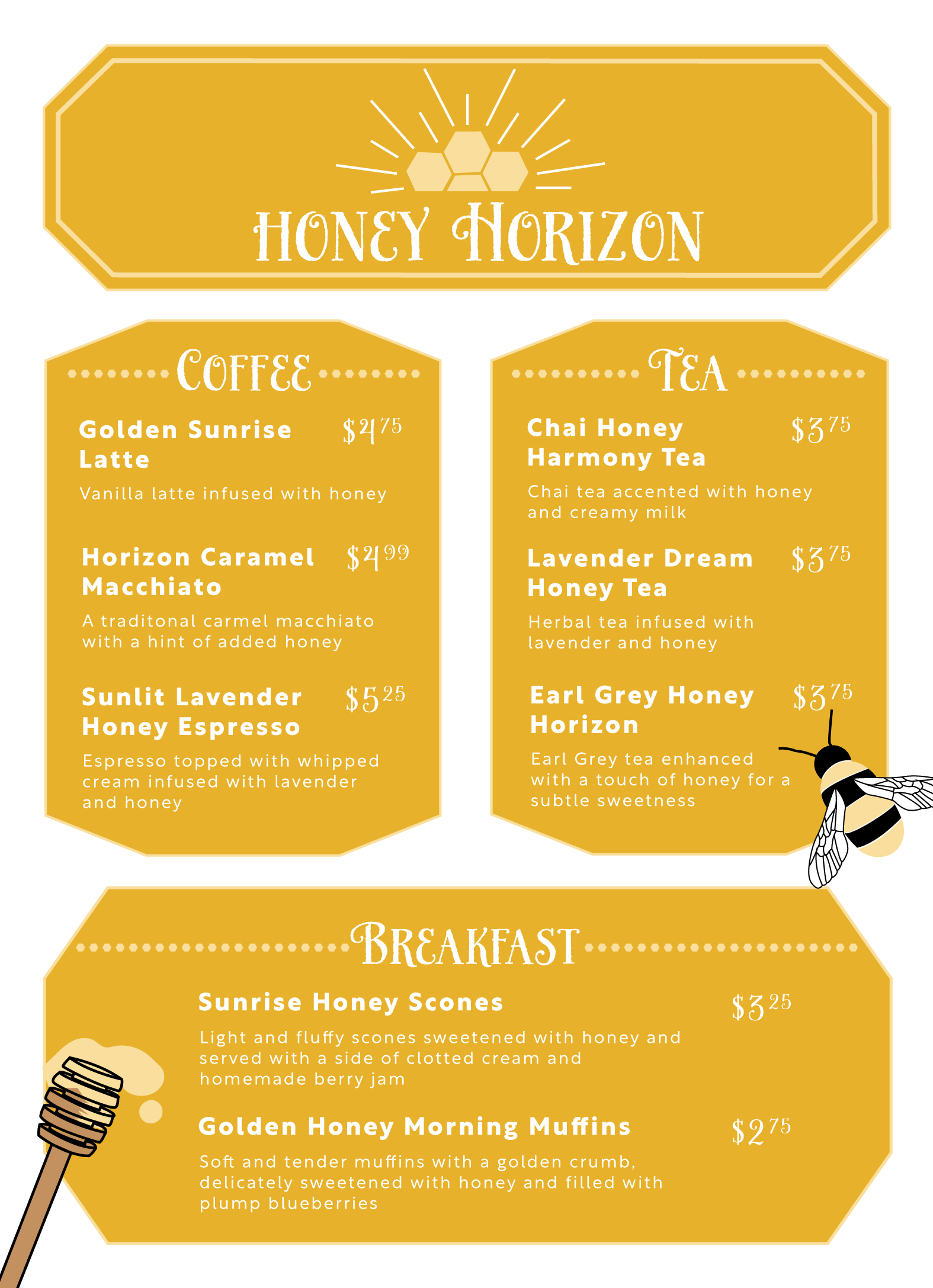
Our assignment was to create a menu using Illustrator and apply what we'd learned about repetition and contrast. Yellow seemed like an obvious choice for a cafe themed around honey and bees. The yellows make a bright, cheerful contrast to the white. Each item on the menu is also honey and horizon-themed, bringing the entire menu together. To add repetition, I used honeycombs in the sun logo and on both sides of the headings. The honeycombs brought visual interest and repetition to the menu, tying everything together. I also added the honeycomb element by forming each information box into a honeycomb shape. This also contributed to the overall theme. If someone were to look at the menu, the combination of yellows, graphics, and honeycomb elements would convey the message without having to look at any text.


